Samsung | Tomoca co-branding
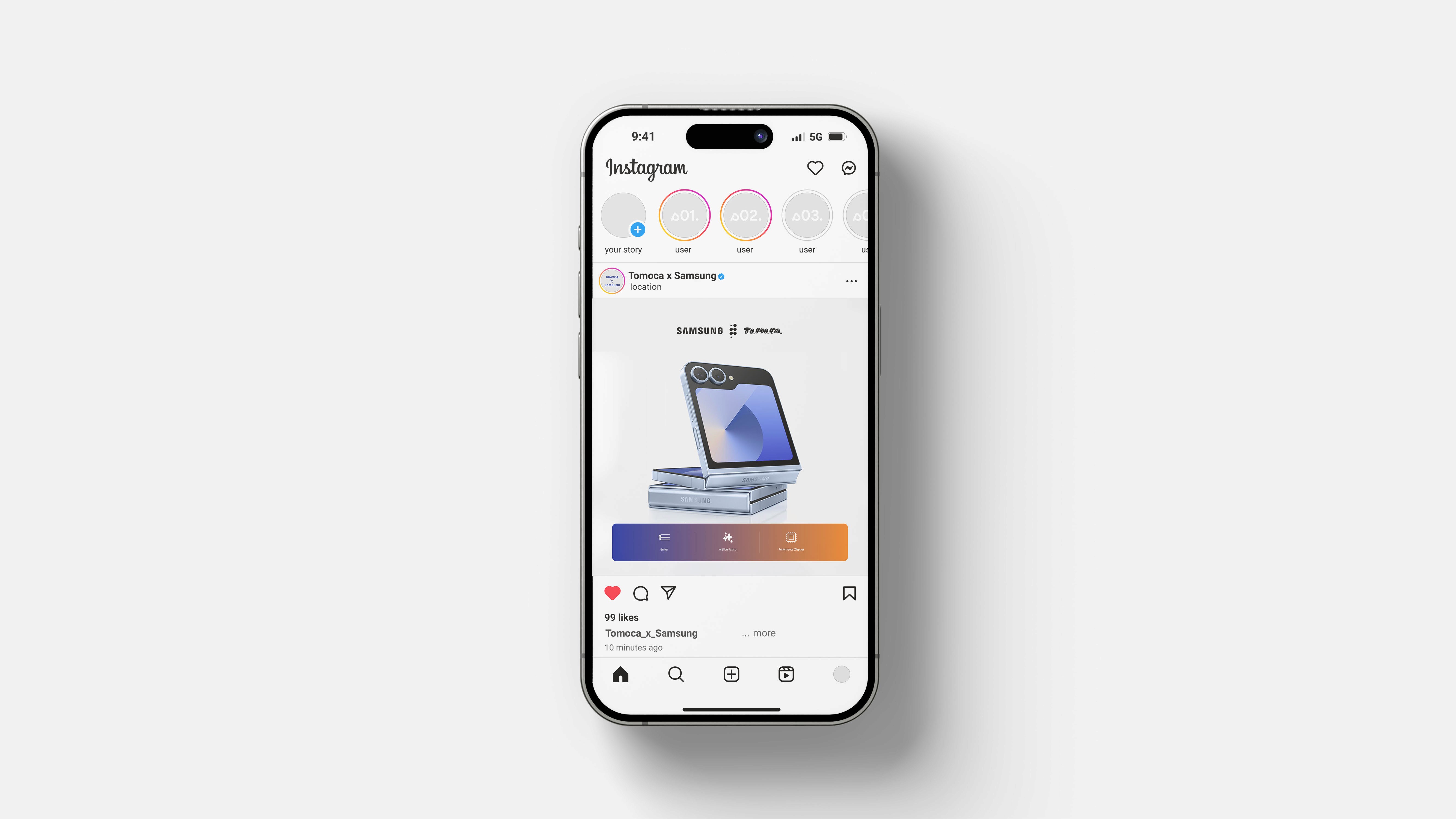
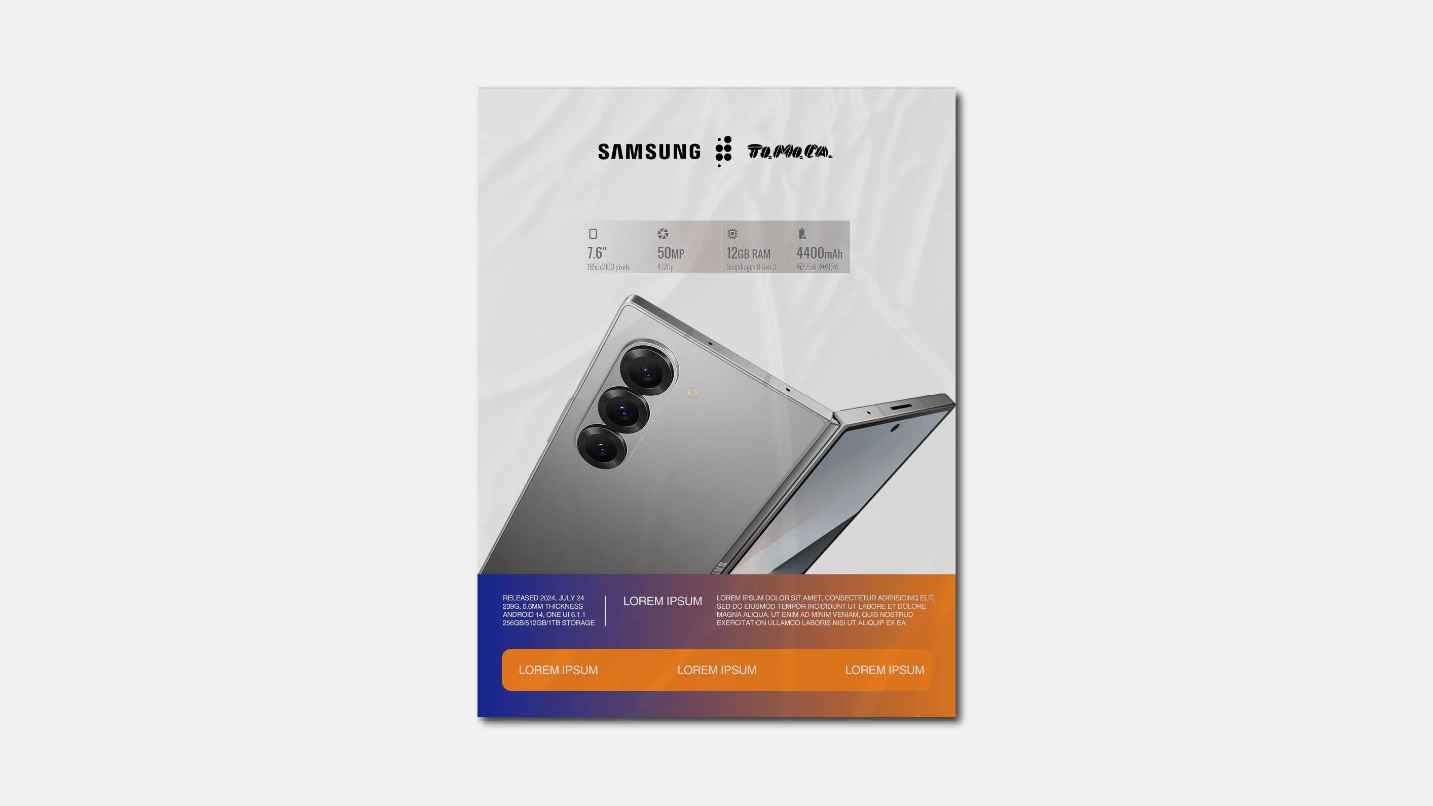
This project show case my contribution as an Art director for Berry for this two brands to collaborate for a marketing campaign.
Direction
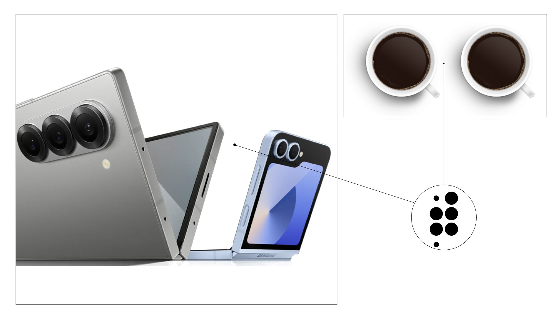
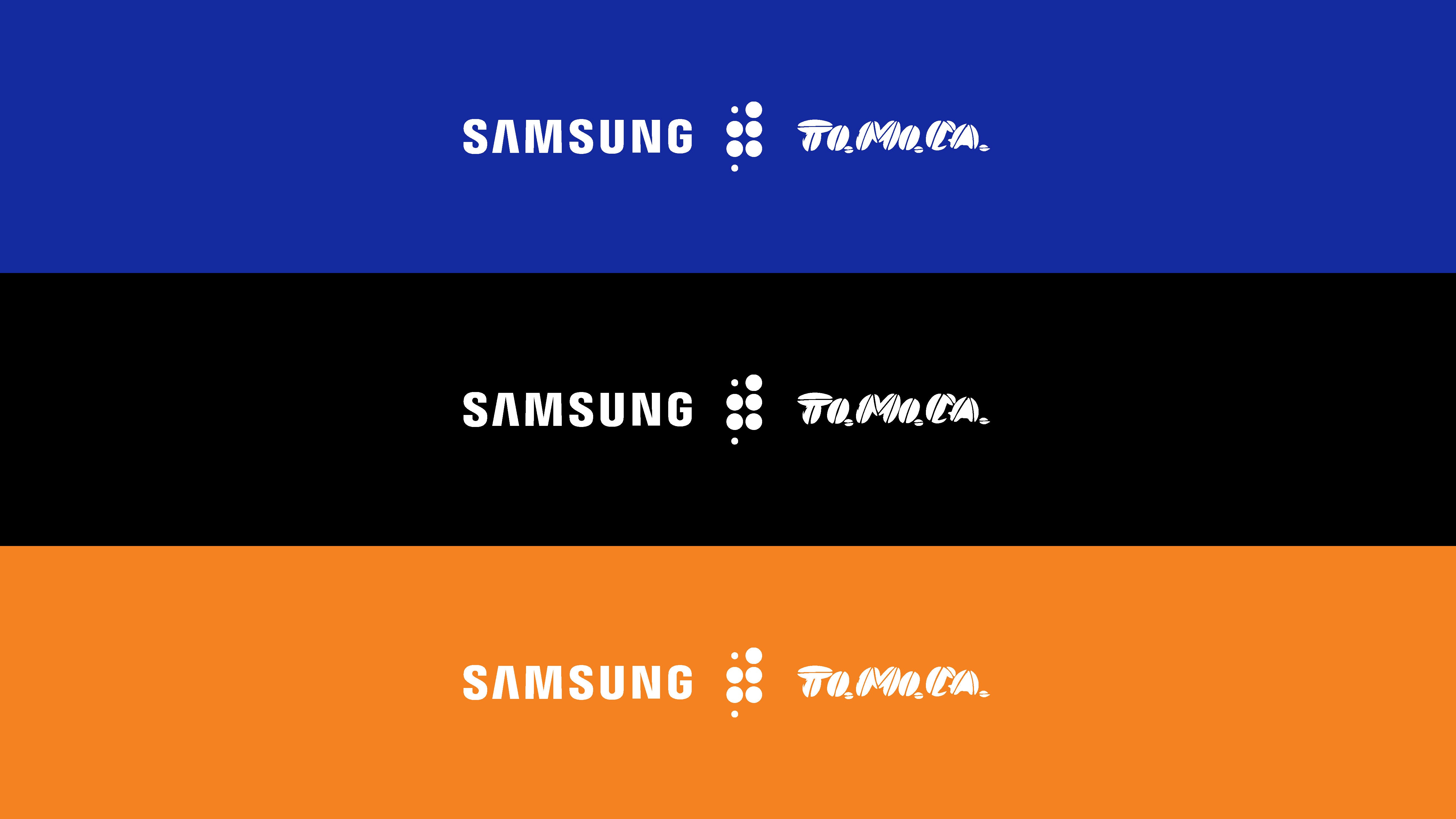
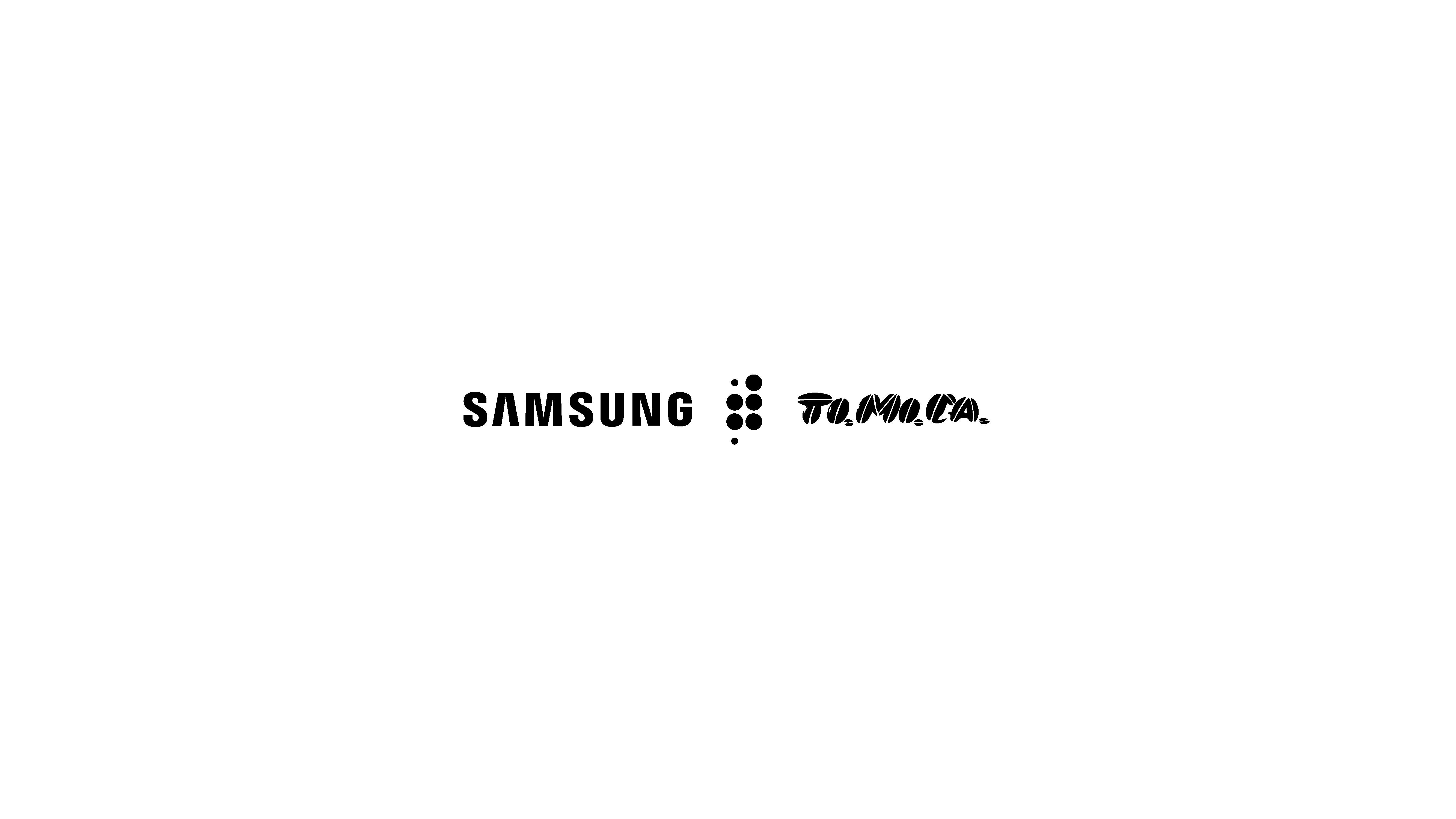
This is a captivating interplay of form and function. It employs a dotted separation of two columns for the two brand logos signifying where culture meets technology. The first column, comprising two large dots, is a reference to the dual camera system of the Samsung Z Flip 6. The second column, consisting of three large dots, pays homage to the triple camera setup of the Samsung Z Fold 6. Additionally, this series of dots also resembles the top view of the a coffee setup. This visual not only captures attention but also leaves a lasting impression, solidifying the partnership between these two brands.